Re-coding classic-computers.org.nz for Mobile (and modern browsers) (A Retrochallenge project)
30th June, 2015 (Start)
Google has told me my classic-computers.org.nz website is not mobile-friendly. They are right. My HTML skills are about as vintage as my machines. My HTML stopped at about version 2.0 and my code uses lots of tables for layout, minimal css, has never heard of "containers" and has no idea what type of element "<article>" is??
My challenge is to completely re-code classic-computers.org.nz to so it is suitable for mobile platforms while adhering to HTML 5 standards. I've already dipped my toe into the water with one part of the site (the collections) which at least is now mobile friendly but the code is still largely legacy.
It's a big job and I may not get through it. This challenge will at least help me focus. I'll certainly learn new skills!
1st July, 2015
Started. Only had time for an hour today though. I spent that time looking for resources on the web. I found a good site at w3schools.com. which contained reference materials, tutorials and examples. This will be my reference. It's a good start.
I've thought also about priorities. If I'm pressed for time, mobile-friendliness will take precedent over trying to make the code pure HTML5. It will be pragmitism over purism.
Editor will be an old copy of Dreamweaver, but most of the editing will be of the raw HTLM. My copy of Dreamweaver is too old to support HTML5.
Here's a priority list...
Group A
- Articles and project (Blog) pages
- Collection pages (made mobile friendly on the weekend but not HTML5)
- Bits and Bytes collection
- Collector pages
Much more difficult will be...
Group B
- The Forums (because it's pHp)
- The Guestbook (because it's pHp)
- The System 80 site (because it's so damm big, idiosyncratic and no Dreamweaver templates are used)
I'm confident about getting group A done. I'm less confident about group B, but we'll see how we go. Even achieving a rebuild of group A before the end of July (1/2 the site) will be a big step forward.
2nd July, 2015
Squeezed in a couple of hours tonight, where I worked on developing the template HTML for a projects/article page (blog page) just like this one. Good progress. I now have a template page which has NO TABLES! Also I beefed up the CSS sheet considerably to cope with the new elements.
It seems to scale to mobile devices quite nicely and gets the Google tick of approval.
The HTLM skeleton (minus the metadata) looks like this...
!DOCTYPE html>
<html lang="en-US">
<head>
<title>"Re-coding classic-computers.org.nz for Mobile (and modern browsers)</title>
<!--[if lt IE 9]>
<script src="https://cdnjs.cloudflare.com/ajax/libs/html5shiv/3.7.2/html5shiv.js"></script>
<![endif]-->
<meta http-equiv="Content-Type" content="text/html; charset=iso-8859-1">
<meta name="viewport" content="width=device-width, initial-scale=1.0">
<link rel="stylesheet" type="text/css" href="maintest.css">
</head>
<body>
<header>
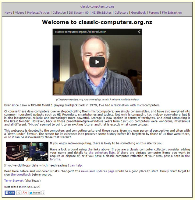
<nav><a href="/html/">Home</a> |
<a href="https://www.classic-computers.org.nz/news.htm">News</a> |
<a href="https://www.classic-computers.org.nz/collection/index.htm">Collection</a> |
<a href="https://www.classic-computers.org.nz/system-80">DS System 80</a><br/>
<a href="https://www.classic-computers.org.nz/bits-and-bytes/index.htm">NZ Bits & Bytes</a> |
<a href="https://www.classic-computers.org.nz/guestbook">Guestbook</a> |
<a href="https://www.classic-computers.org.nz/forums/index.php">Forums</a> </br>
<a href="https://www.classic-computers.org.nz/collectors">Collectors</a> |
<a href="https://www.classic-computers.org.nz/floppy-disk-file-extraction-service.htm">File Extraction</a><br/></nav>
<hr>
<h2>Tezza's Projects and Articles (blog)</h2>
<a href="https://www.classic-computers.org.nz/blog/index.htm">Index</a><br/>
</header>
<article><h2>The title of the article would go right here </h2>
<h3>Here is a subheading </h3>
<p>This is where the main text would go. This page is now completely without tables!! It also used the new HTML5 elements <header>, <nav> and <article>. I've also added a lot of new stuff to the CSS file. </p>
<p align="center"><img src="images/IBM-XT-large-800-600.jpg" alt="IBM XT" border="1"></p>
<p align="center" style="font-style:italic">Figure 1. Here is a big fat 800x image which should scale down in a mobile device. </p>
</article>
<footer>
</footer>
</body>
</html>
The CCS stylesheet now looks like this...
header, article, section, footer, aside, nav, main, article, figure {
display: block;
}
body {font-family: Verdana, Arial, Helvetica, sans-serif; font-size: 0.91em; line-height: 1.2;
max-width: 900px; background-color:#FFFFDD; margin: auto; margin-top: 8px; margin-bottom: 8px;border:1px solid #000000;}
header {background-color:#CCCCCC; padding:10px; border-bottom:1px solid #333333;}
article {padding:10px; background-color:#FFFFFF;text-align: justify; }
p { font-family: Verdana, Arial, Helvetica, sans-serif; font-size: 0.91em; line-height: 1.2;}
h1 { font-family: Verdana, Arial, Helvetica, sans-serif; font-size: 1.7em; font-weight: bold;}
h2 { font-family: Verdana, Arial, Helvetica, sans-serif; font-size: 1.25em; font-weight: bold;}
h3 { font-family: Verdana, Arial, Helvetica, sans-serif; font-size: 0.91em; font-weight: bold;}
td { font-family: Verdana, Arial, Helvetica, sans-serif; font-size: 0.91em; line-height: 1.2;}
li { font-family: Verdana, Arial, Helvetica, sans-serif; font-size: 0.91em; line-height: 1.2;}
div { font-family: Verdana, Arial, Helvetica, sans-serif; font-size: 0.91em; line-height: 1.2;}
A:link {text-decoration: none}
A:visited {text-decoration: none}
A:active {text-decoration: none}
A:hover {text-decoration: underline; color: red;}
img, embed, object, video {
max-width: 93%;
}
Compare it to the HTML behind the one you are reading!
This is just a start though. I'm not happy with the nav layout at the top yet and I need to add a footer, which will also have navigation. I need to experiment more with that. That will be the next task.
Tez
3rd July
Did several things today...
- Posted a note to the classiccmp mailing list requesting for thoughts on the necessity (or not) to cater for pre-2000 browsers. A wide range of comments were received
- Finalised my navigation links for the mobile-friendly website template.
- Implemented those changes in the "Projects and Articles" sub-section
The latter took a bit of tweaking. I had to remove all the unnecessary <TABLE> tags from the document. Dreamweaver's find and replace was good for this although it was still a chore. I also took out all the HEIGHT and WIDTH attributes from the <IMG> tags in all documents so the pictures would scale down in mobile
All in all I'm reasonably happy with the result. There may be more tweaks yet as things go along and I have to check every page at some point, just to make sure they are all ok. Essentially that's one section done though.
Next task is to give the collections site the same navigation structure.
Tez
6th July
During this process I've had to make a number of design decisions. I'll leave explaining the WHY of them until the last summary/reflections page when the project is finished. That way they will be in an easily digestible piece rather than scattered through this narrative.
Anyway, great progress over the weekend!
I've finalised on retaining a centered 900 pixel width format so pages are not too wide on a large screen but dynamically resizes when on mobile, thanks to the max-width: 900px; <body> attribute.
After many iterations and "suck-it-and-see" type tests I've finalised on a navigation structure (under the <nav> tag) for the whole site. Most 1st-level sub-sites will have this left aligned in the header AND in the footer. This is what it will look like on the typical mobile phone...
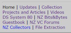
The exceptions are the NZ VC Forums and Videos. The former is pHpBBs code that I don't want to mess with and the latter goes straight to a YouTube index. Both have back links to the site though, so no worries...
The footer will also have this same <nav> element so people don't have to scroll back up to get to the navigation. The footer will also have a "Go to Top" link.
Ideally, it would be best for ALL pages to have these links at the top and bottom, but this is where one has to compromise for mobile views. I've decided to give 2nd level and below pages a simple link back to the first level page it hangs off. This reduces the clutter considerably on mobiles.
What's done
So here is the status of the various site sections as regards mobile-friendliness and HTML5 revamps.
- Home - Done.
- Updates - Done
- Collection - Done
- Projects and Articles - Done
- NZ Bits and Bytes - Done
- Guestbook - Done, but not without some difficulty. This pHp script still has some TABLES determining the format but that's ok...they are mobile friendly and acceptable to HTML 5. I had a difficult time getting the pages to centre but in the end discovered I was using a centering attribute in the wrong element. Live and learn!
- NZ VC Forums - Done! I was dreading this one. A websearch discovered someone had already done the work for PhPBB boards, so it was just a matter of installing that style. Great! Fantastic!
- NZ Collectors - Done
- File Extraction - Done
What's not done
The only remaining part on the website to be processed is the Dick Smith System 80 sub-site. This is by way the largest segment of the site and will take some time (weeks!). It has many levels. It is also the earliest part of the site, having been developed way before classic-computers.org.nz existed. No Dreamweaver templates are used, tables are used exclusively for (idiosyncratic) formatting and there is minimal use of CSS There are many levels, hundreds of pages and they will all need to be processed separately.
It will be a very time-consuming job.
I've made better progress than I'd hoped for though so I'm now confident it will be finished before the month is out!
9th July
New System 80 navigation structure is evolving. Here is the latest draft. No javascript menus to the side, just simple links at the top and bottom, which squeeze up nicely and are quite usable in a smartphone screen. Links are red because they are all visited. Unvisited links are green.
About 150 pages in the System 80 site though so there is a lot to process. Onwards and upwards!
Tez
11th July
Hmm...never say something is DONE! I've tweaked the navigation layout once again tonight. I'm happier with it now. Rather than having the name of the sub-site at the top of the navigation block before general nav links, it's been put on the bottom. There is now an overall header title for the whole site on those top level pages (except the System 80 section). It just flows better.
I've also moved the FB/Google+/Twitter links at the top to the right. They look tidier there.
A few of the top pages have a splash graphic at the beginning. I've moved these to the right. Again, it's tidier.
Many thanks to Earnest G. Allen who noticed that some of my non-breaking space code was showing as text because I'd left out the last character i.e. a ";". Interestingly Chrome didn't need that last character to produce an invisible non-breaking space, which is why I'd never picked it up!
Slowly working through the System 80 pages. Won't have much spare time over the next week though.
14th July
I've decided to do away with the RSS feed for updates and ask people to subscribe to my Twitter account instead. I'll post links to updates there. Modified the appropriate pages accordingly.
About 1/2 way through the System 80 site. I'm happy with the way it's looking, at least on my own computer. I won't upload the revised pages until the whole site is finished. I'm finding and correcting some minor errors on the way.
So many pages to edit....
Also changed the tables in the "Collectors" subsite to a simpler colour scheme. It will make updates easier.
17th July
Half-way stocktake
Progress has been good. Really good! I've now accomplished my major objective which was to make my whole classic-computers.org.nz site mobile-friendly. On mobile devices the pages now come up with that coveted "mobile-friendly" tag in Google searches! Hooray!
The final part of this mobile-friendly re-structure was a re-vamp of the System 80 site. This was a big job. It entailed a change of navigation structure and appearance, where all 160-odd html pages needed to be processed individually. It's the third iteration of the site since it was launched in 1999.
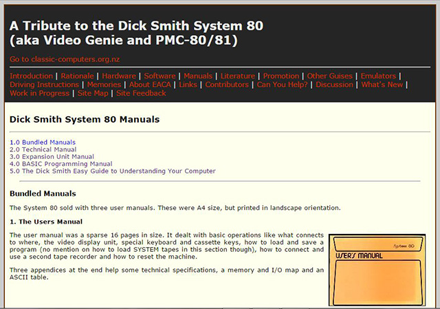
It's gone from looking like this...
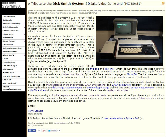
Figure 1. Dick Smith System 80 Website before
To this...
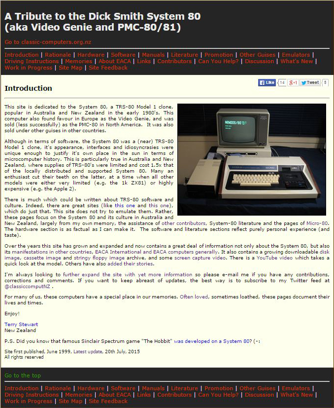
Figure 2. Dick Smith System 80 Website after
Check it out! If you have recently visited the site (i.e. before the revamp), you might need to refresh to see the new structure.
Underneath, much (but not all) of the table structure used for formatting has been done away with in accordance to HTML5 standards. Also Javascript is now not needed. At the same time I've made other changes such as:
- Converted the ZIPs with PDFs of hardware and software manuals into actual PDF files. Now people can access and read these directly.
- Amalgamated some sections (e.g. the manuals and memories) so they are on one page rather than several.
- Done away with the Flash videos of some games (let's face it, Flash is dying technology) and replaced them with my YouTube videos of the same.
So what's next?
I'm well ahead of schedule. One reason for that is the existence of a ready-made mobile-friendly version of the pHp code for my Forum site. I'd expected to spend a long time on that. In the end it only took me an hour or so. Even the guestbook wasn't as challenging as I thought it might be.
Retrochallenge is a good time to focus on one goal so I'll continue working to improve classic-computers.org.nz until the end of the month, rather than start any new retro-computing projects. Some other things I'll work on from now until the end of July are:
- Getting some better photos of the System 80 (outside and inside) to replace some already on the System 80 site. These were taken with an early 2000s digital camera and it shows.
- Add more Twitter/Facebook/Google + buttons to self contained pages on the System 80 site. At the moment there is only one the front page. People don't usually come in through the front door though and they may wish to share a particular page.
- Updating my Collection pages. They don't all represent the current "existing state" of my hardware. For example on some of these pages I mention items I'm looking for or projects/improvements I might do. I've now got those items, or completed those projects and I need to tweak the pages to reflect that.
- Revisit my blog pages and add updates where appropriate. Some of these pages describe experiences and techniques I've revisited later. Although they are a narrative about what happened at the time, some articles could do with just a footnote, updating the information in view of more recent happenings/findings. This will make older postings more useful to people seeking information.
- I have the final 1987 Dec/Jan scanned issue of New Zeland Bits and Bytes which I must add to that section.
- Making the pages conform even more the HTML5 standard. Although the site is now mobile friendly and is far more HTML5 compliant than it was, it still has a lot of old outdated code and ways of doing things. There is even one page which still uses the <center> tag (gasp!). I'm not too worried about this as all browsers support older code, but if I get some time I may do some more work in the background on this.
If you think of anything I haven't mentioned that could be improved on the site, or spot any errors, let me know.
22nd July
Added some new pictures to the System 80 hardware models page showing closeups of several models, each with minor additions/variations. I'd like to get a close up of the System 80 MkII at some stage. I don't own one yet thought but know someone who does. I'll touch base with him and see if he can spare a photo.
23rd July
More progress with pictures. There was a section on the System 80 site, where I had some closeups of the innards of my original black label System 80. I've completely re-written this page, showing close ups of the circuitry of two of my machines. An original Mk1 system 80 and a System 80 Blue Label. These represent the first and last variant of the line. These images will be a good source of reference for anyone either working on a System 80, or wants to know what kind of variant they have.
I've now just about done with the System 80 site revamp. The only remaining task is to try to get hold of a large image of a Mk II model from somewhere for the hardware models page!
Next job will be to go through all my collection pages and ensure they reflect the current state of affairs.
26th July
Good progress on that "to do" list above over this weekend.
First I managed to get the final issue of NZ Bits and Bytes for 1987 up to the server. That completes this section.
Second. (and the big achievement of the weekend) was to go through all 55 pages describing my collection and update them with the latest status of machines, manuals or peripherals, linking where necessary to blog articles. Although this usually just involved altering or adding a paragraph or two, each page now paints a more accurate picture of what I have, and what needed to be done (or what still needs to be done!) to get the computers to the working "display status" I was (or am) looking for. In that way it personalise the collection more and hopefully makes the pages more interesting to people. I always aimed for a more human touch rather than just a list of specs. Wikipedia is for the latter.
I also duplicate the social media buttons so they are on the top right as well as the bottom left. This should help mobile users to share them easier without a lot of scrolling.
Check them out. If you spot any errors let me know (and don't forget to refresh your browser if you've been to the site lately).
31st July
Time to summarise. This competition is great in that it FORCES you do get your A into G and do those that need doing rather than procrastinating. The limited time and requirement for updates gives focus.
My project involved a re-vamp of websites under classic-computers.org.nz. The main task was to make the entire domain mobile-friendly. In the course of this I would try to make the code as HTML 5 compliant as possible and also update sections where necessary.
So did I achieve these objectives? For the most part, yes:
- All sites under the domain are now mobile friendly (the main objective - Yay!)
- CSS styles sheets play a much larger role than imbedded tags
- The System 80 site underwent a major revamp, not just in navigation but also content in some places
- Other sites were (mostly) updated and navigation tweaked
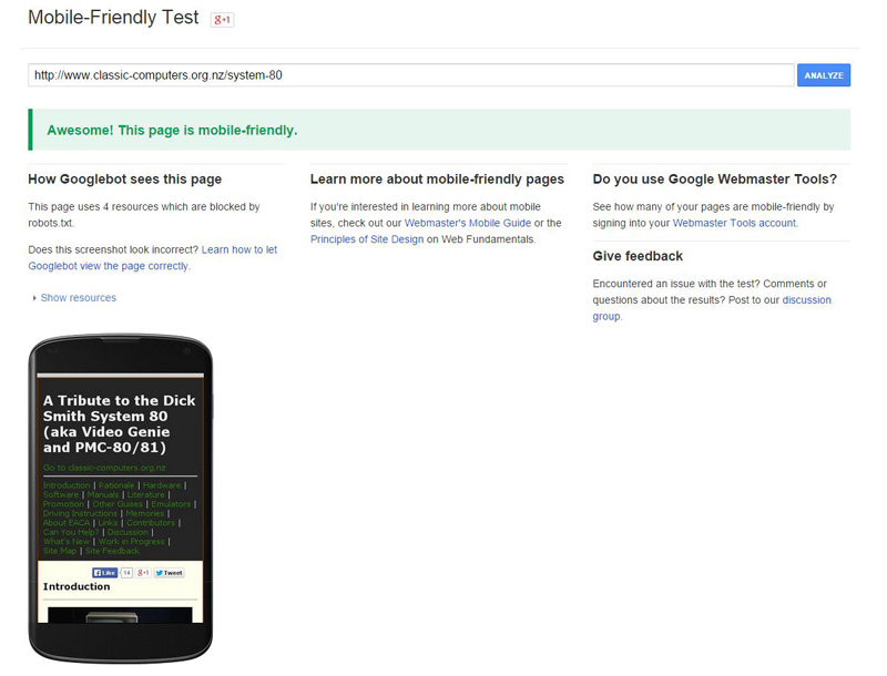
Figure 3. Mobile-friendly test for the System 80 index page
The only sub-section that hasn't been revisited for a CONTENT update is the blog site. Some pages (in the "Tips, how to and advice" section) have been done, but I'm going to need more time to work through the other pages and add footnotes to articles where I feel updates are needed. All pages under the domain are not entirely HTML 5 compliant either. There are some <table> tags still used for formatting but a whole lot fewer than there used to be. Certainly the <font> tags are largely gone. Size and fonts can dynamically change according the the platform.
I had hoped to elaborate on the rational behind my various design decisions in this summary. Truth be told, I'm just out of time to do this. My weekend is entirely booked up with other things and Retrochallenge will close before I get around to it. I guess it's up visitors to the sites to determine if what I've done works or not. Any feedback on the website(s) would be welcome.
All in all a productive month! Thanks to the organisers for the event.
Tez